How Do You Choose an Interior Paint Color?
Maybe you’ve just bought your first home and are looking to customize it into your dream home, or maybe you’re just looking to liven up a bedroom you’ve had for years but that never lived up to its potential. Whatever the case, a fresh coat of paint can go a long way toward defining an interior space and giving it lasting appeal.
With so many paint choices out there, however, it’s not always easy finding the right color for a room, while ignoring factors like lighting and clashing tones can leave you unsatisfied with the paint you choose. To choose an interior paint color that you’ll be happy with long-term, there are a few things you need to know about paint and how it’s used. These tips will give you information you need to make a good choice that you won’t regret later.
Understanding Paint Terminology
Tone, tint, shade — what does it all mean, anyway? While it may seem annoying, understanding the words used to describe paint will help you find the color you need. For instance, the three words above refer to how much gray, white or black pigment respectively is added to a color. By choosing, say, three colors with a similar tone — that is, the amount of gray paint in them — you’re more likely to find colors that work well together.
You also may have heard of different kinds of colors. Cool colors, for instance, include blues, greens and purples and often make the viewer feel calm or think of nature. When cool colors also have a soft tone — that is, when there’s more gray mixed in — they’re also known as passive colors, which are often used for bedrooms and other quiet spaces. By contrast, warm colors, which include red, orange and yellow, can make a space feel cozier. When they’re a brighter tone, warm colors are called active colors, which are great for adding passion or excitement to a room.
Colors like brown, gray, white or black are neither bright nor cool. Instead, they’re known as neutral colors. Because they don’t stand out as much on their own, they tend to pair well with warm or cool colors without making a room feel too “busy.” Bright white is a neutral color and one of the most popular overall. Not only does it go with everything, but it can also make small spaces feel bigger. It can also be great if you’re selling your house, since white is agreeable to most people and easily painted over by those who don’t care for it.
The Art of the Color Wheel
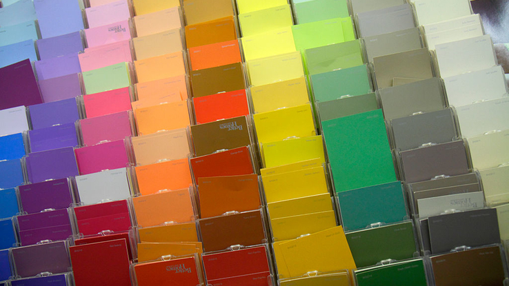
Once you have an idea of what you’re going for in a room (cool colors for a calming space, active colors for something flashier, or whatever the case may be), you’ll need to think about how specific colors interact. A color wheel can be particularly useful for this task, as it makes it easy to identify different colors in matching tones.

You can use it to create a regal monochromatic color scheme with different neutral colors in the same family, or you can choose matching tones to make a diverse range of colors work together. Meanwhile, bright colors can match the busy atmosphere of a kitchen or family room, and softer tones of any kind can add a sense of refinement. Whatever you choose, keep in mind that you can even use a color wheel for coordinating the colors of your furniture as well.
The Final Test
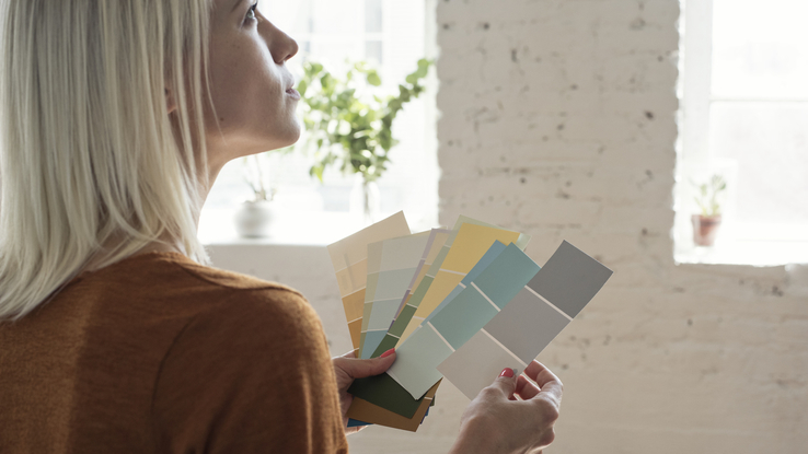
Rather than lugging home cans of paint only to discover that the color you selected doesn’t quite work, select a few paint chips — strips of paper featuring similar colors that you can get in the paint aisle of most hardware stores — and purchase sample-sized bottles based on what you like. You may not know if a color is right until you apply it to your wall, as the material of your walls and the other colors in a room can have a serious effect on how the paint looks. With trial bottles, however, you can do exactly before committing to a large quantity of paint.
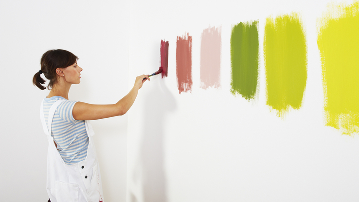
Once you’ve picked out a few trial colors, apply them to your wall and see how they look at different times of the day. Not only will colors that looked good in the store not necessarily work at home, but you may even find daylight (or the absence thereof) can have a huge impact on how a color looks. Perhaps the pale gray you selected that’s so perfect in the afternoon is a bit too dark at night, or maybe that teal blue looks washed out once the sun shines on it. Through a trial-and-error process, you can find what colors look best not just in theory, but in practice as well.